- Jan 23, 2025
Choosing the Perfect Planner Colors for 2025 🎨
How to Choose Planner Colors in 2025 (Top 2 Best-Selling Colors Trending In Planners)
As we step into 2025, it's essential to stay ahead of the curve, especially when it comes to planner colors. The planner market is evolving, and understanding the trending colors can significantly impact your design choices and sales. So, what are the standout colors for planners this year? Let's dive in and explore the top two colors that are dominating the scene!
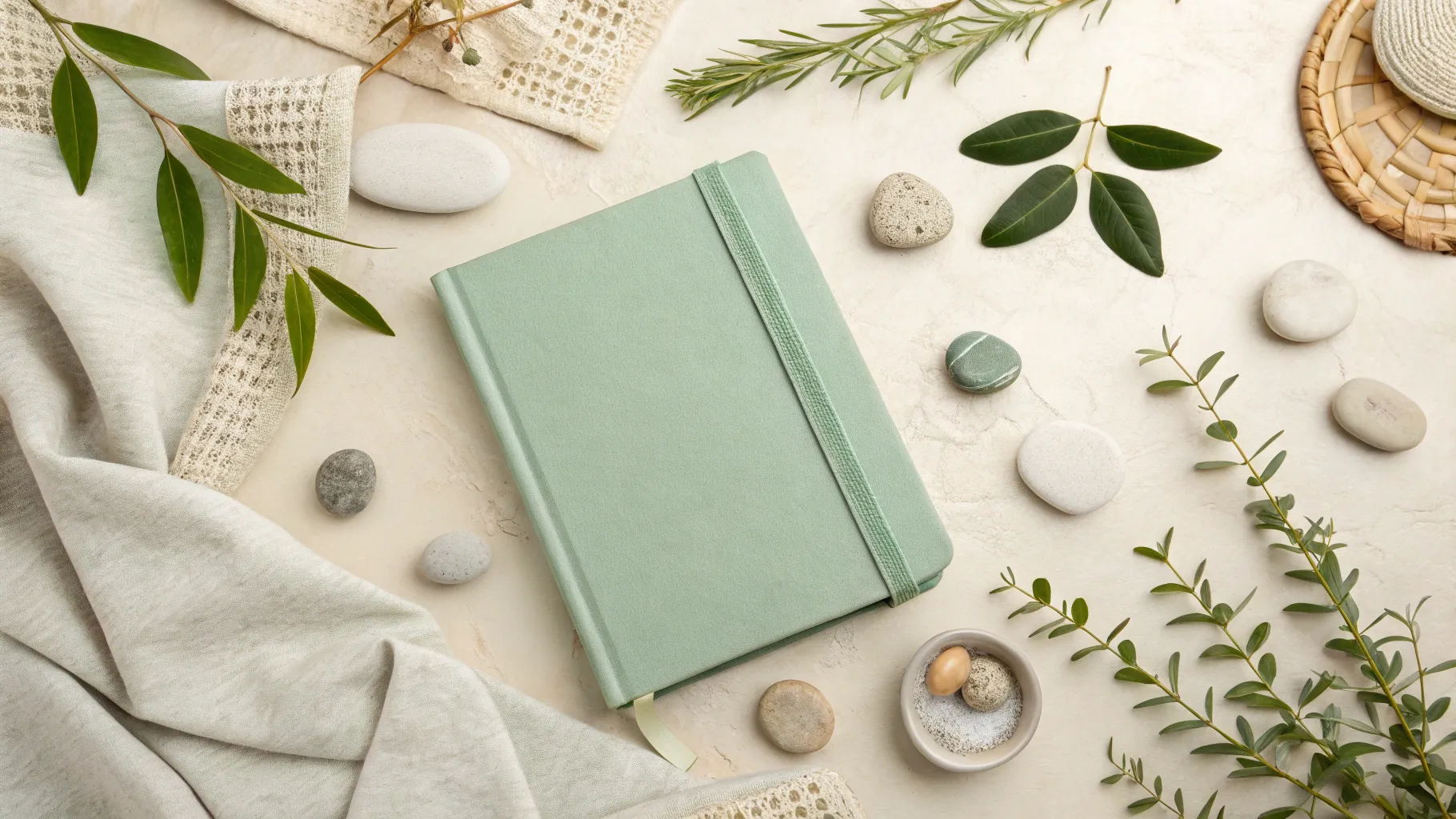
🌿 The Rise of Sage Green
First up is sage green, a color that has become increasingly popular in the planner community. This earthy tone offers a calming vibe, making it perfect for those seeking tranquility and balance in their planning. Various brands have embraced this shade, showcasing it in different forms:
Cultivate What Matters: Their version, named "Aloe," has captured the hearts of many.
Day Designer: They introduced "Sage Book Cloth," which is elegant and sophisticated.
Sugar Paper: Their planners in sage green are flying off the shelves.
Many Etsy sellers have reported that sage green planners are selling out fast. This trend is not just limited to physical planners; digital planners and stickers in this color are also in high demand. For instance, Passion Planner has embraced sage green in their "Year of the Snake" edition, aligning with the Lunar calendar's new year.
🏺 Terracotta: The Second Power Color
If sage green doesn’t appeal to you, terracotta is another top contender. This warm, rich color evokes feelings of warmth and comfort. Here’s how different brands are interpreting terracotta:
Elise Brand: Their terracotta planners are gaining popularity.
Hustle Sley: They offer a lighter version of terracotta that adds a unique twist.
Passion Planner: They also have terracotta options that cater to diverse tastes.
Interestingly, Archer and Olive have chosen terracotta as the sole color for their 2025 dated planner, which speaks volumes about its popularity. This color pairs beautifully with earthy tones and can complement the sage green trend nicely.
🌍 Embracing Earthy Tones
For those who might not resonate with sage green or terracotta, there’s still hope! Earthy tones are trending, and they offer a broader palette that can include variations of both colors. These tones can provide a grounding effect, making them perfect for planners designed to help users navigate their busy lives.
While sage green and terracotta may dominate the market, they only account for about 35% of planner sales. This means there's a significant opportunity for other colors to shine. If you have a favorite color, don’t hesitate to incorporate it into your designs!
🔍 Finding the Right Color Palette
Now that we’ve established the trending colors, how do you go about selecting the perfect palette for your planner? Here are some effective strategies:
📌 Utilize Color Psychology
Color psychology can provide insights into how colors can affect mood and behavior. While brighter colors can evoke feelings of happiness and energy, softer shades can create a sense of calm. Consider your target audience and the emotions you want to evoke when selecting colors.
📌 Explore Pinterest
Pinterest is a treasure trove of inspiration. You can search for trending colors and find various palettes that resonate with your vision. For example, you might come across shades like:
Cherry Red: A vibrant choice that adds a pop of excitement.
Butter Yellow: A warm, inviting color reminiscent of sunshine.
Indigo: A deep, rich color that can add sophistication.
Dill Green: A stronger variation of sage green, offering a bolder option.
📌 Use Online Tools
There are numerous online tools to help you generate and visualize color palettes:
AI Color Palette Generator: Live Preview Colors on Real Designs
Realtime Colors - Visualize your colors and fonts on a real website
These tools allow you to create, customize, and test color combinations effortlessly, ensuring that your planner designs are visually appealing.
🖌️ Testing Your Color Choices
Once you've generated a palette, it’s crucial to test how the colors look together. Consider the following:
Check for contrast: Ensure that text is legible against your background colors.
Visual appeal: Make sure the colors evoke the right feelings and align with your brand identity.
Feedback: Don’t hesitate to ask friends or colleagues for their opinions on your color choices.
💡 Additional Tips and Resources
As you embark on your planner design journey, here are some additional tips to keep in mind:
Stay updated with trends: Regularly check platforms like Instagram and Pinterest to see emerging color trends.
Be flexible: While it's essential to focus on trending colors, don't shy away from incorporating your unique style.
Consider seasonal colors: Some colors may resonate better during specific seasons, so keep that in mind when designing planners for different times of the year.
For those looking to expand their knowledge on planner design, consider checking out free courses like Planner 101 and InDesign 101 to enhance your skills.
🎉 Conclusion
Choosing colors for your planner designs in 2025 can be both fun and strategic. By focusing on sage green and terracotta, while remaining open to earthy tones and other variations, you can create planners that resonate with your audience. Remember to utilize tools, resources, and your creativity to craft stunning and effective planner designs!
What are your thoughts on the trending colors for planners this year? Are you excited to incorporate them into your designs? Share your thoughts in the comments below!
Return To Blog
Blog Posts
Pretty Fabulous YouTube Channel
It's LIVE + FREE
AI Selfies 101
Never waste thousands of $$ on a photoshoot ever again
Give yourself an AI photoshoot to match any branding you have!