- Jan 24, 2025
PowerSheets 2025 vs 2019: An In-Depth Review 🗓️
Let’s dive into the world of PowerSheets and explore the evolution from the Laura Casey version to the current Our Daily Grace edition. As someone who has used these planners extensively, I want to share my honest thoughts on what’s changed, what remains the same, and what that means for your planning experience. Whether you’re a long-time user or new to the PowerSheets, this review will help you decide if the 2025 edition is worth your investment.
Packaging: A Tale of Two Experiences 📦
Packaging is often overlooked, but it plays a crucial role in the unboxing experience. Laura Casey’s PowerSheets set the gold standard with their beautiful, thoughtful packaging. The planners came in a lovely box that said "Oh Happy Day," and if you ordered multiple planners, they would arrive in a beautifully designed outer box adorned with lovely tape. This attention to detail made receiving the planner feel special, almost like a collector's item.
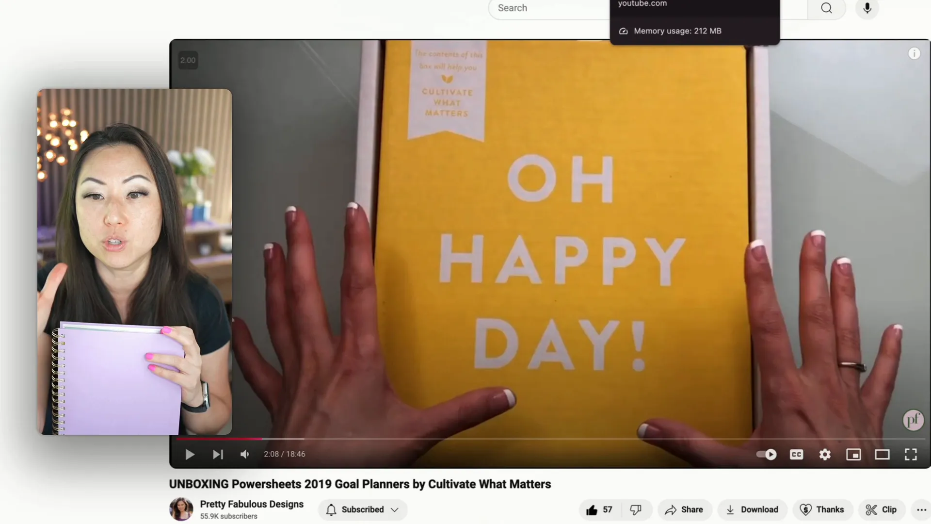
In contrast, the Our Daily Grace version arrives in a much simpler packaging—shrink-wrapped cardboard that lacks the charm of its predecessor. While it’s lightweight and cheaper to ship, the experience feels stark and less inviting. It’s like the difference between flying first class and coach; you still reach your destination, but the journey feels drastically different.
Price: Value for Money 💰
Pricing is another area where the PowerSheets have seen some changes. Laura Casey's original bundle, which included various accessories like pens and washi tape, sold for $89. This comprehensive package created excitement and anticipation among buyers, often leading to quick sell-outs.
This year, the retail price for the PowerSheets is $64, with a sale price of $55. While it’s nice to see a quicker sale, I can’t help but feel that the absence of bundled items diminishes the perceived value. The excitement of receiving a comprehensive package has been replaced by a more basic offering.
Materials: A Step Down? 📜
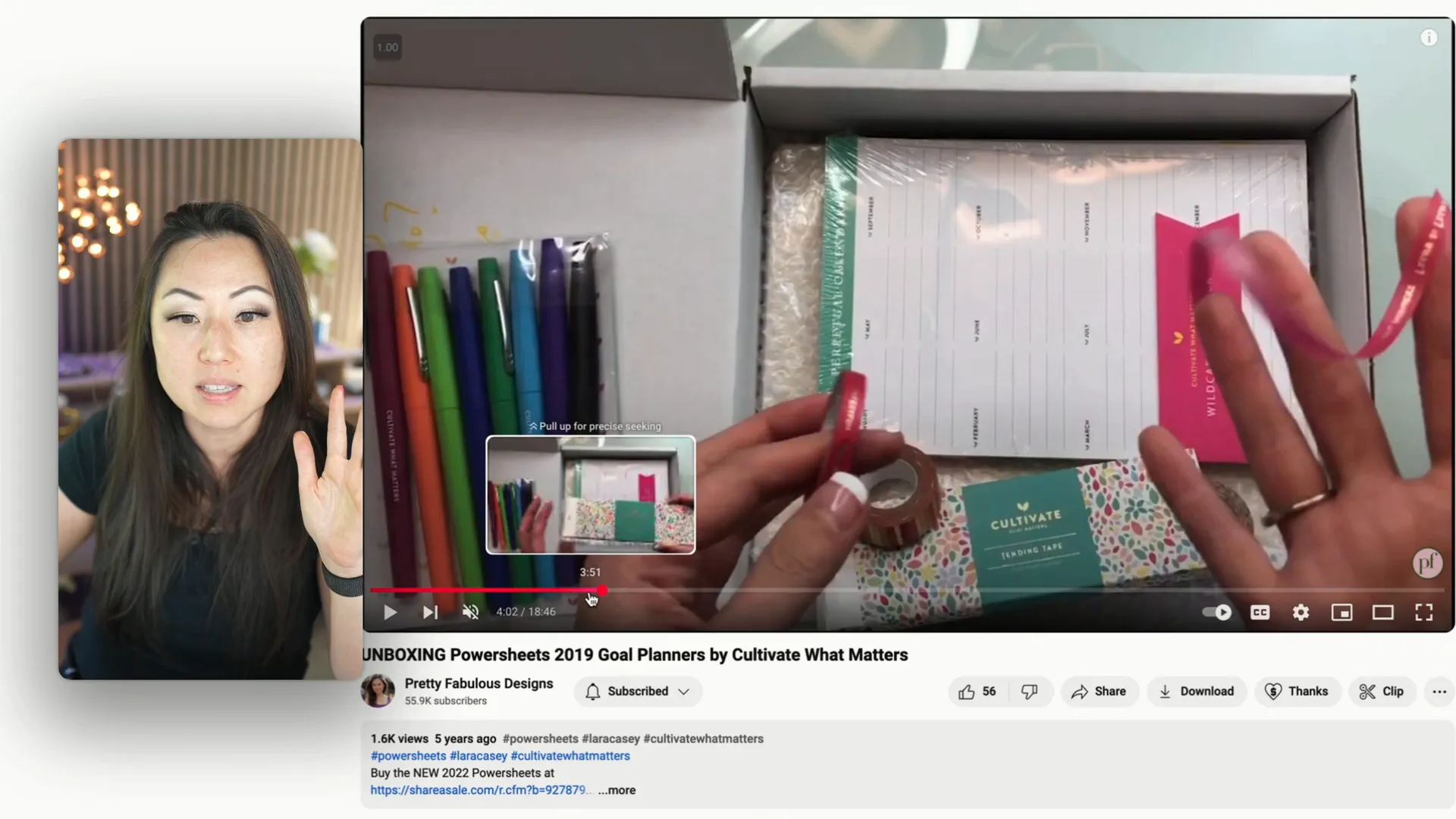
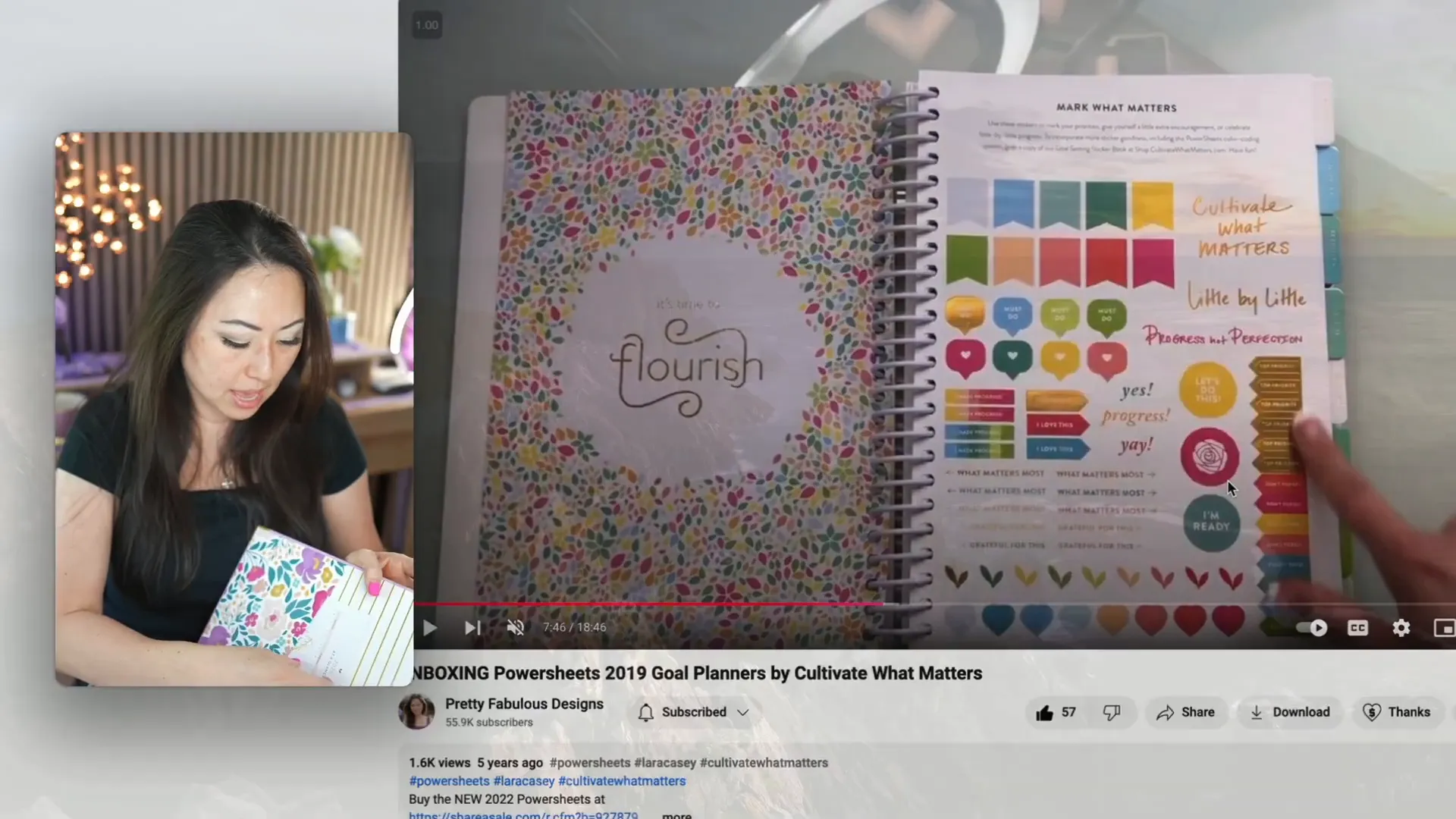
When it comes to materials, the changes are noticeable. The original PowerSheets included a sticker book embedded within the planner, making it feel interactive and fun. The 2025 edition only includes a single small sheet of stickers, which feels inadequate. Additionally, the overall quality of the paper seems to have declined. Users have reported issues with bleed-through and ghosting, which detracts from the overall experience.
Furthermore, the cardstock used for the "Word of the Year" section feels thinner and flimsier compared to previous editions. This decline in material quality is disappointing for those expecting a premium product.
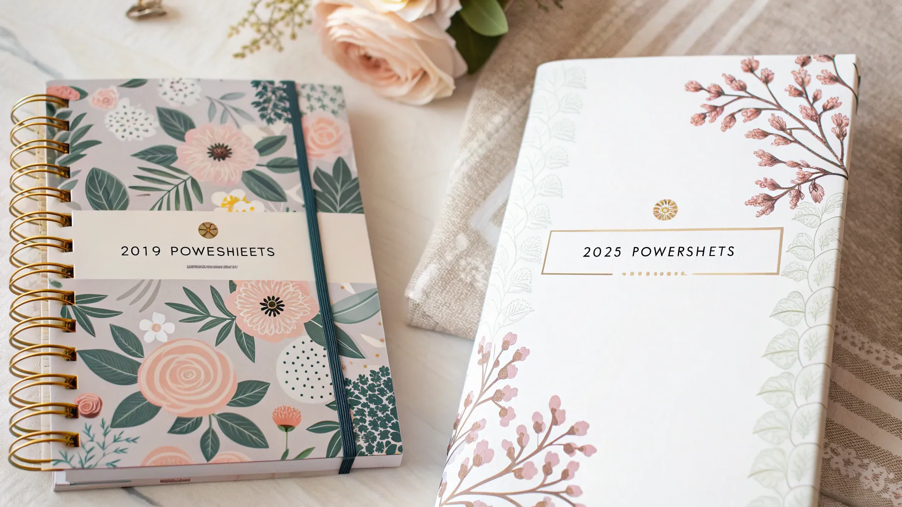
Cover Colors: A Mixed Bag 🎨
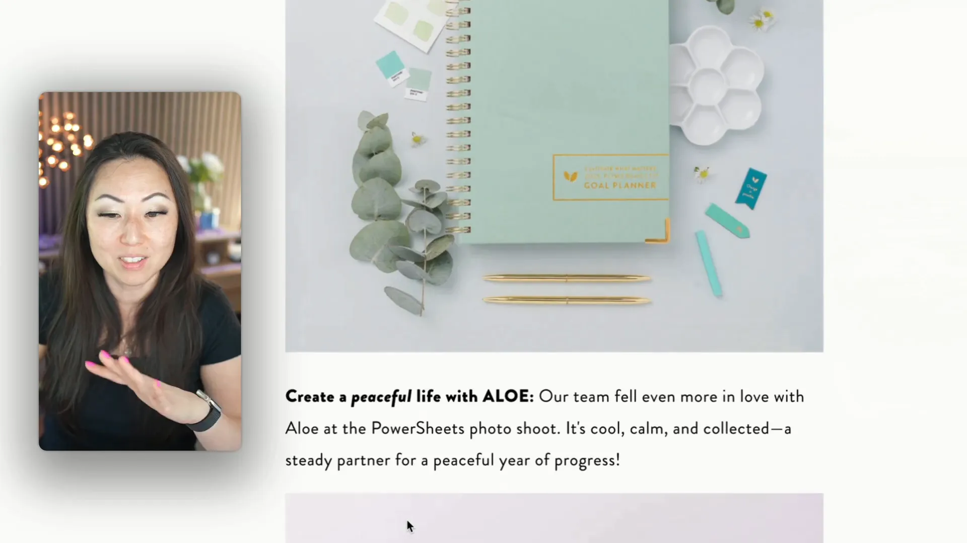
Cover colors have always been a point of discussion within the planner community. While the 2025 edition offers some appealing options like purple, there are also some less desirable choices. It seems that every year, certain colors are included that simply don’t resonate with consumers. The muted sage color, for instance, has not been well-received.

Overall, the cover designs are similar to past years, but I wish the company would focus on the best-selling colors rather than trying to surprise users with new, less popular options.
Interior Colors: Where's the Inspiration? 🌈
One of the highlights of the original PowerSheets was their vibrant and energizing interior colors. These bright hues inspired users to fill out their planners eagerly. Unfortunately, the 2025 edition features much duller, muted colors that lack the same energy. Opening the planner now feels like a chore rather than an exciting opportunity to reflect and plan.
The colors create a somber mood, which is not ideal for a planner designed to motivate and inspire. It’s disheartening to see such a significant change in this aspect.
Layouts: Consistency or Stagnation? 📋
The layouts in the PowerSheets have remained relatively consistent over the years, which can be both a blessing and a curse. While familiarity can be comforting, it can also lead to stagnation. The 2025 edition introduces a new roadmap feature that’s visually appealing, but beyond that, the changes feel minimal. Users may find themselves asking, "What’s really new here?"
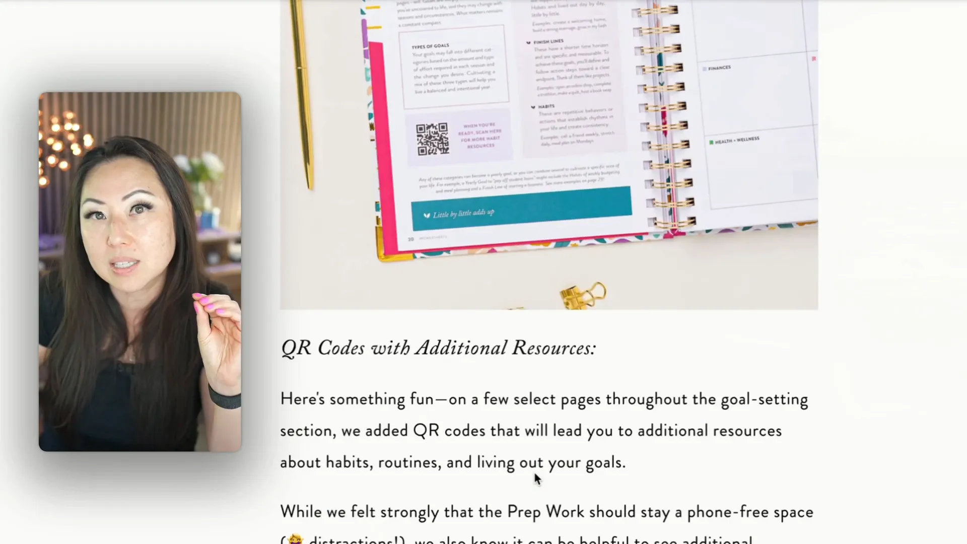
There are some minor adjustments, like a few larger boxes and the inclusion of QR codes, but the overall layout remains largely unchanged. The additional QR codes, while a modern touch, don’t lead to particularly exciting content either.
Marketing: A Decline in Energy? 📈
Marketing plays a crucial role in how products are perceived, and this is where the PowerSheets seem to have taken a step back. Laura Casey’s marketing was vibrant and engaging, featuring stunning photos that made the planners feel like a part of a joyful community. The imagery was often used as stock photos because they were just that good.
In contrast, the current marketing feels lackluster. The styles used in the photos are reminiscent of trends that were popular years ago, and there’s a noticeable absence of effort in presenting the product. It lacks the excitement and community feel that once surrounded the PowerSheets.
Gold Foiling: A Dull Finish? ✨
Finally, let’s talk about the gold foiling. In the past, the PowerSheets featured bright, shiny gold accents that added a touch of luxury. This year’s edition, however, has switched to a more muted bronze color that feels flat and uninspired. This choice aligns with the overall dull aesthetic of the new planners, which is disappointing for those who appreciated the previous design’s flair.
It’s a small detail, but for many users, these little touches contribute to the overall experience of using the planner. A shiny gold foiling can elevate the product, making it feel special and worth the investment.
Conclusion: Is It Worth It? 🤔
After comparing the 2025 PowerSheets to the 2019 version, it’s clear that there have been significant changes, most of which lean toward the negative. From packaging to materials, colors, and marketing, the experience has shifted from one of excitement and inspiration to something more muted and basic.
If you’re considering investing in the PowerSheets, weigh the pros and cons carefully. If you loved the vibrant energy and thoughtful packaging of the past, you might find the new edition lacking. However, if you’re simply looking for a functional planner to help you set and achieve goals, the 2025 edition may still serve its purpose.
Ultimately, if you’re interested in creating and selling your own planner, consider signing up for my free course Planner 101 for insights into packaging, marketing, and design strategies that can help your planner business stand out.
So, what do you think? Will you opt for the new PowerSheets, or stick with something that has a bit more flair? Let’s discuss in the comments!
Return To Blog
Blog Posts
Pretty Fabulous YouTube Channel
It's LIVE + FREE
AI Selfies 101
Never waste thousands of $$ on a photoshoot ever again
Give yourself an AI photoshoot to match any branding you have!