- Jan 28, 2025
Unboxing the Zollie Color Palette Card Deck: A Designer's New Best Friend
Color Palette Card Deck Unboxing | Physical Color Matching Tool for Designers & Creators

Hey there, fellow creatives! Today, I'm super excited to share my thoughts on the Zollie Color Palette Card Deck. As a designer, I'm always on the lookout for tools that can help streamline my workflow, and this physical color matching tool has caught my attention. Let's dive into the unboxing experience and see if it lives up to the hype!
🎨 First Impressions
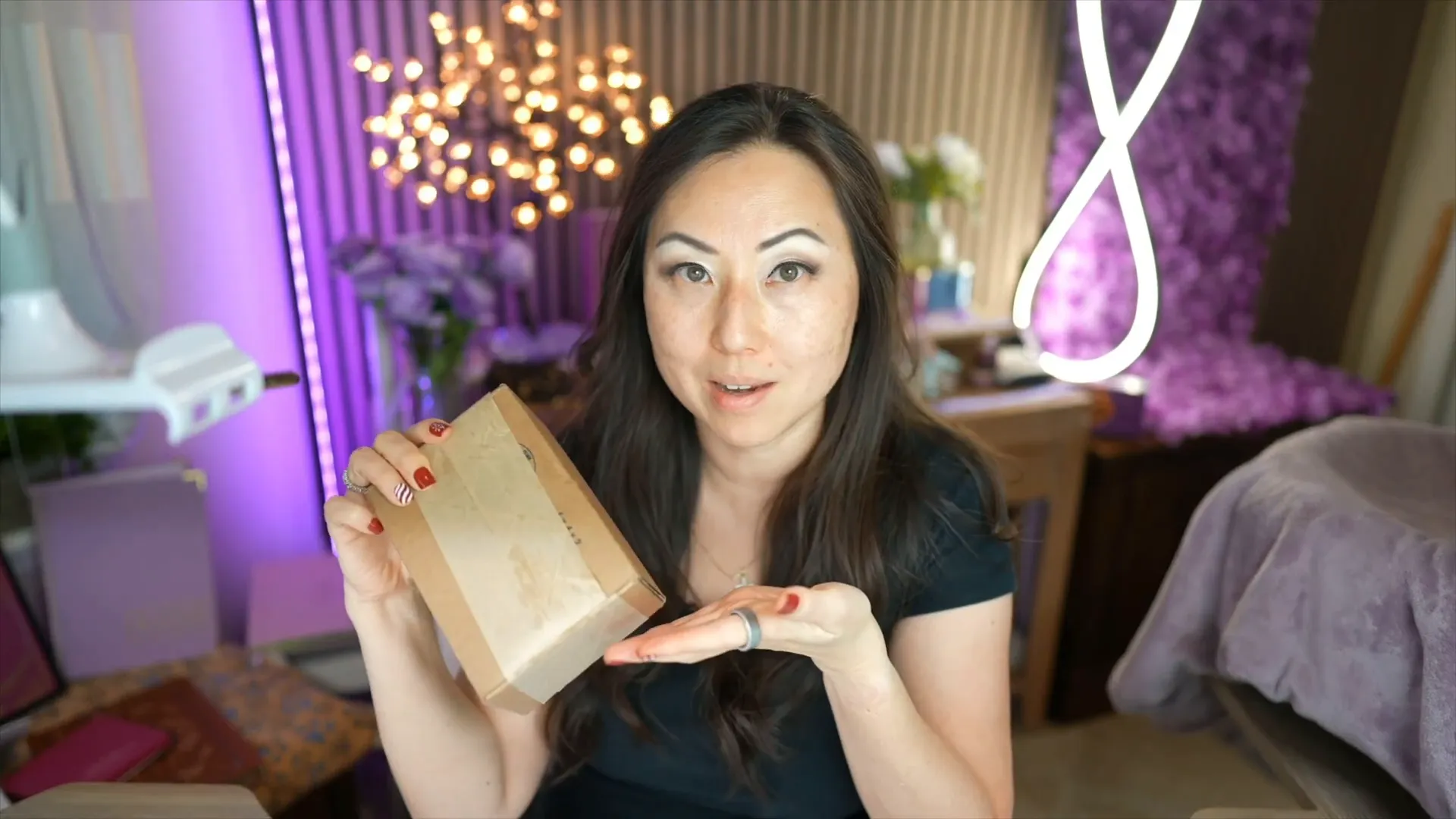
Upon receiving the Zollie Color Palette Card Deck, I was thrilled to find it arrived swiftly—almost like Amazon Prime! The whole bundle cost me $88, and I was eager to explore what was inside these sleek, shrink-wrapped boxes. Physical color palettes are a rarity in my digital-heavy world, so I was looking forward to experiencing something tangible.

📦 What's Inside the Box?
Once I got through the endless shrink wrap, I found multiple components inside the box. However, I was a bit disappointed with some of the included materials. The package comes with:
A set of color cards
Generic information about color theory
Instructions on how to pick a palette (which I disagree with)
Challenge cards that I found unhelpful
Let’s just say, I have a different approach to color matching than what was suggested in the instructions. I believe that tossing out the generic advice is the best way to go!
💡 How to Use the Zollie Cards
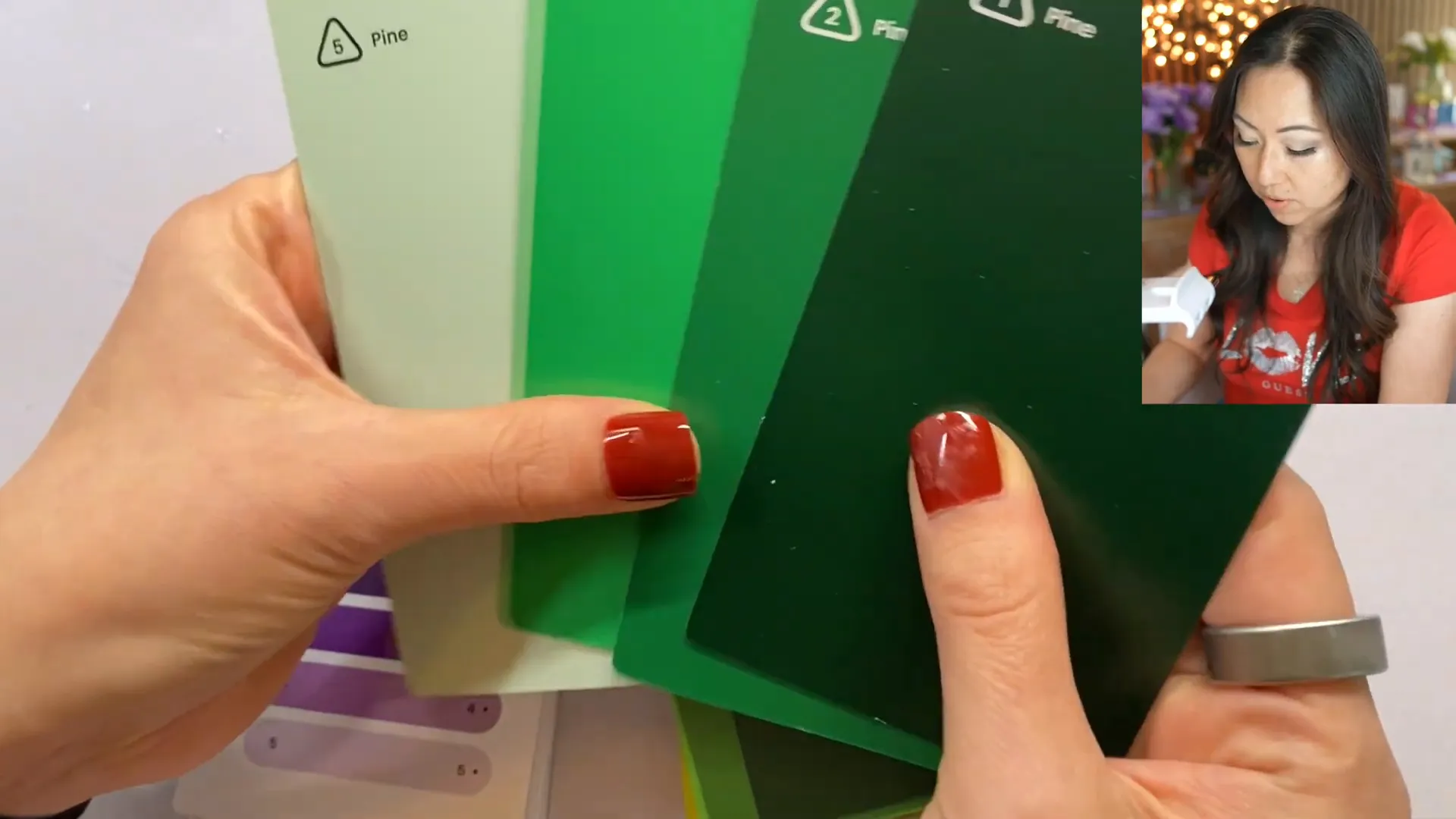
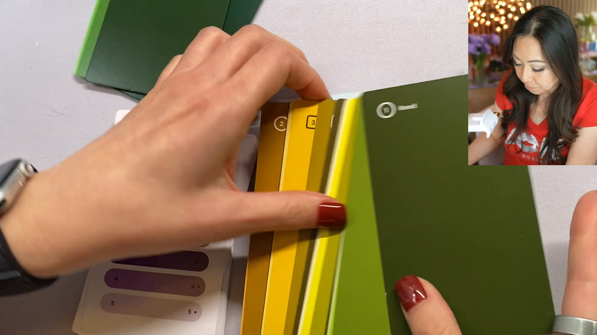
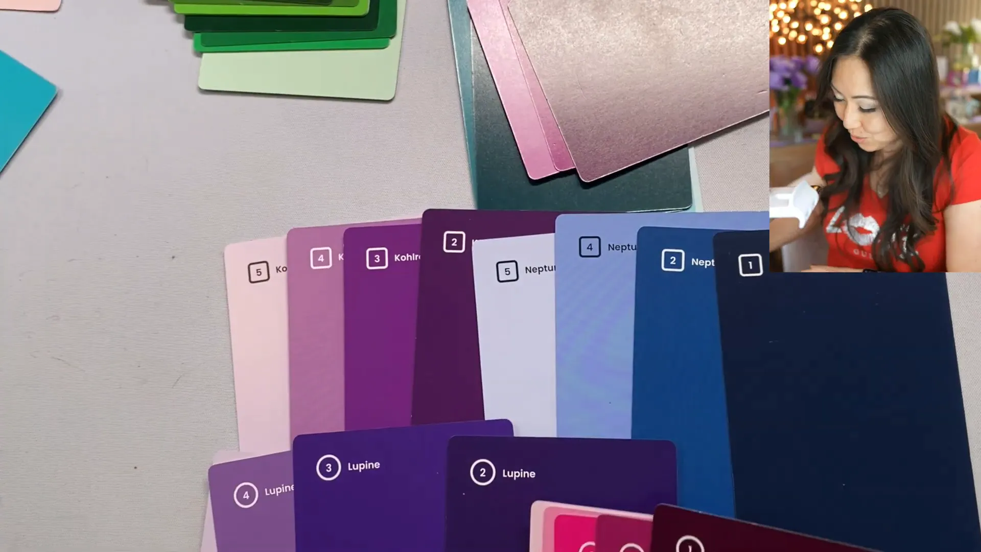
The main feature of these cards is that they offer five different shades of a single color. For instance, one shade is named "Pine" and another "Quetzel." The cards have dots on the back to indicate tones, which means they have gray added for a muted look. Personally, I prefer vibrant colors, so I’ll be focusing on the more lively side of the cards.
🌈 Choosing Colors: My Method
When selecting colors, I recommend picking a primary color, a secondary color, and some accent colors. Here’s a peek into my thought process:
Start with your primary choice.
Consider a secondary color that complements it.
Add accent colors for depth and interest.
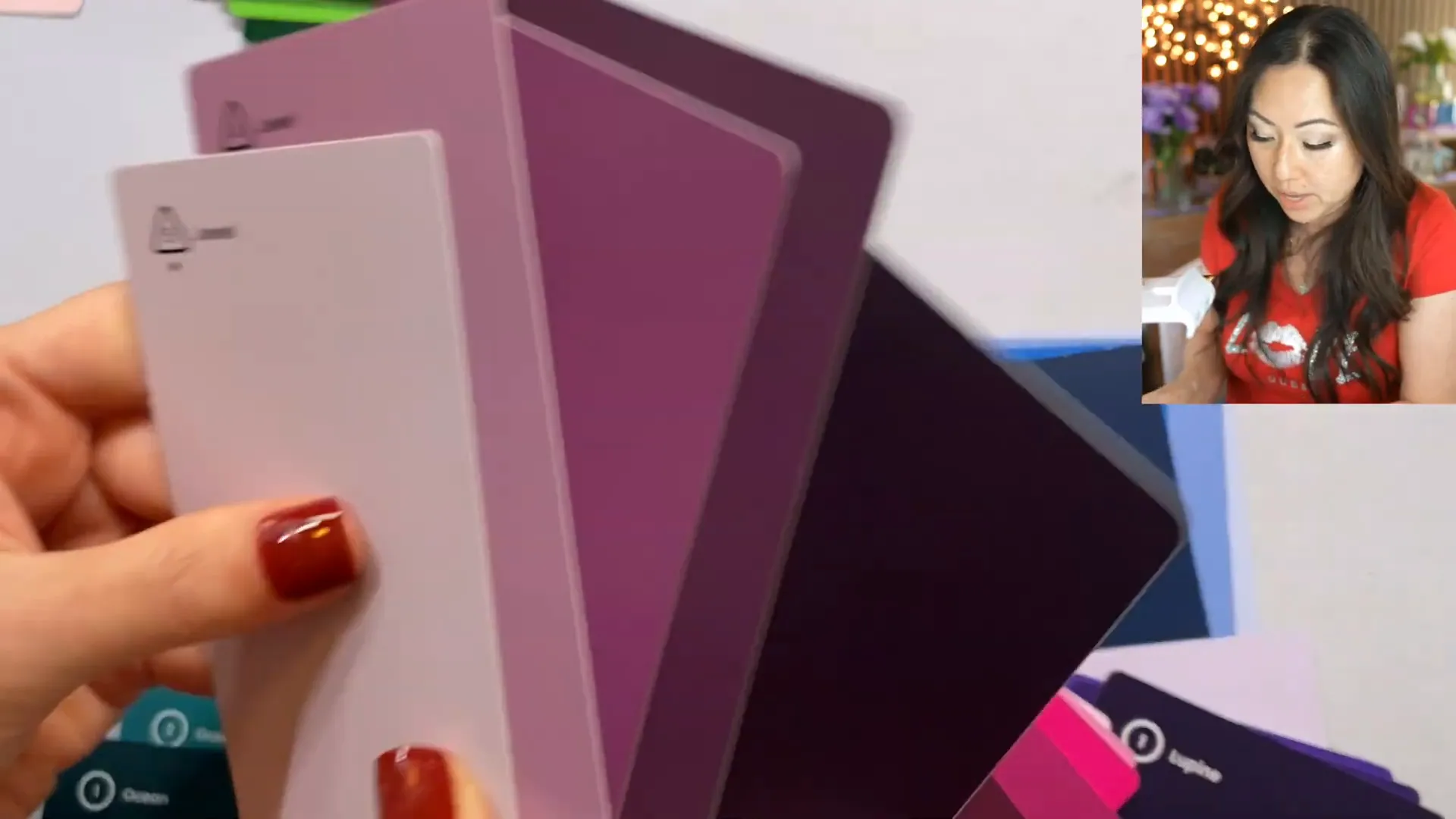
As I sifted through the cards, I quickly discarded the duller tones, focusing instead on the more vibrant options. Colors like “Lupine” and “Ocean” caught my eye, while others like “Neptune” felt too bright for my taste.

🔍 Pairing Colors
One aspect I found particularly helpful was the way the cards indicate color combinations. For example, complementary colors are located directly opposite each other on the color wheel. However, some suggested combinations felt off to me. I mean, who really wants a color scheme that resembles the Minnesota Vikings or Christmas? Not me!
🖌️ My Final Color Choices
After some deliberation, I settled on a palette that I believe will work perfectly for my upcoming projects. Here are the colors I chose:
Ocean
Lupine
Neptune
Jewel
Ibis
These colors scream vibrancy and creativity, and I can’t wait to use them in my designs!
💭 Is the Zollie Color Palette Card Deck Worth It?
Absolutely! I find immense value in having a physical tool to aid my design process. While I often rely on digital tools, there's something refreshing about having a tangible reference for color palettes. The vibrant colors I selected are not only beautiful but also complementary, making them perfect for my branding and design projects.
🌟 Conclusion
If you're a designer looking for an easy and effective way to match colors, the Zollie Color Palette Card Deck is a fantastic addition to your toolkit. It allows you to see and feel the colors, which can lead to more thoughtful design choices. Plus, the vibrant hues can inspire creativity in ways that digital palettes sometimes can't.
I'll be leaving a link below for anyone interested in checking out the Zollie Color Palette Card Deck. If you want to use the same colors I’ve selected, I’ll also provide the hex codes for you to get started!
Thanks for joining me in this unboxing adventure! I hope you found it insightful. Until next time, happy designing!
Return To Blog
Blog Posts
Pretty Fabulous YouTube Channel
It's LIVE + FREE
AI Selfies 101
Never waste thousands of $$ on a photoshoot ever again
Give yourself an AI photoshoot to match any branding you have!